


Creating great training materials doesn’t always require a master curriculum developer to be effective. So what makes for great training materials and how do we create our own for your user community?
Think of creating great training materials like putting together an awesome Halloween costume. Training materials should be:
- Eye catching
- Easily understood
- Easy to navigate
Sounds a bit far-fetched so let’s break this down a bit. Check out the information below.
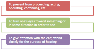
What do you think the image was trying to convey?
Now look at the image below:
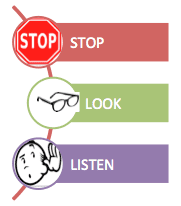
You may have noticed the bottom image is more clear for you to review and to remember. For the record, both images are conveying the exact same message. One spelled out all of the details with formal definitions and one used clear images and words or sound bites to create the learning objective.
Let’s take a look at the 1,2,3’s.
Rule #1:
Make your content eye catching. Your materials should be memorable. It’s helpful to think of the action in your training materials and locate an image that conveys the message. The more words you have on a page, the less likely a user will remember them. Create the visual first.
Rule #2:
Write content in brief, easy to understand statements. One common error is writing too much information or too many options. Writing information in command statements is best. Be brief. Be directive. Focus training on what users will be following 80% of the time.
Rule #3:
Screen shots and directions to take users to the clear end result by the shortest click path possible. Creating obstacles like unnecessarily switching screens or giving too many choices to get to the end result will usually find your users at a dead end.
Try creating your own set of instructions for using these quick tips!
Happy training.

Share this: